Plotly.js: Getting Accurate Coordinates from Click Event
Across StackExchange and the Plotly.js community forums, there seems to be one frequently asked question that has not yet been answered: how can you get accurate coordinates from a click event on a Plotly chart?
Take your standard scatter plot: https://codepen.io/plotly/pen/LVMRMO
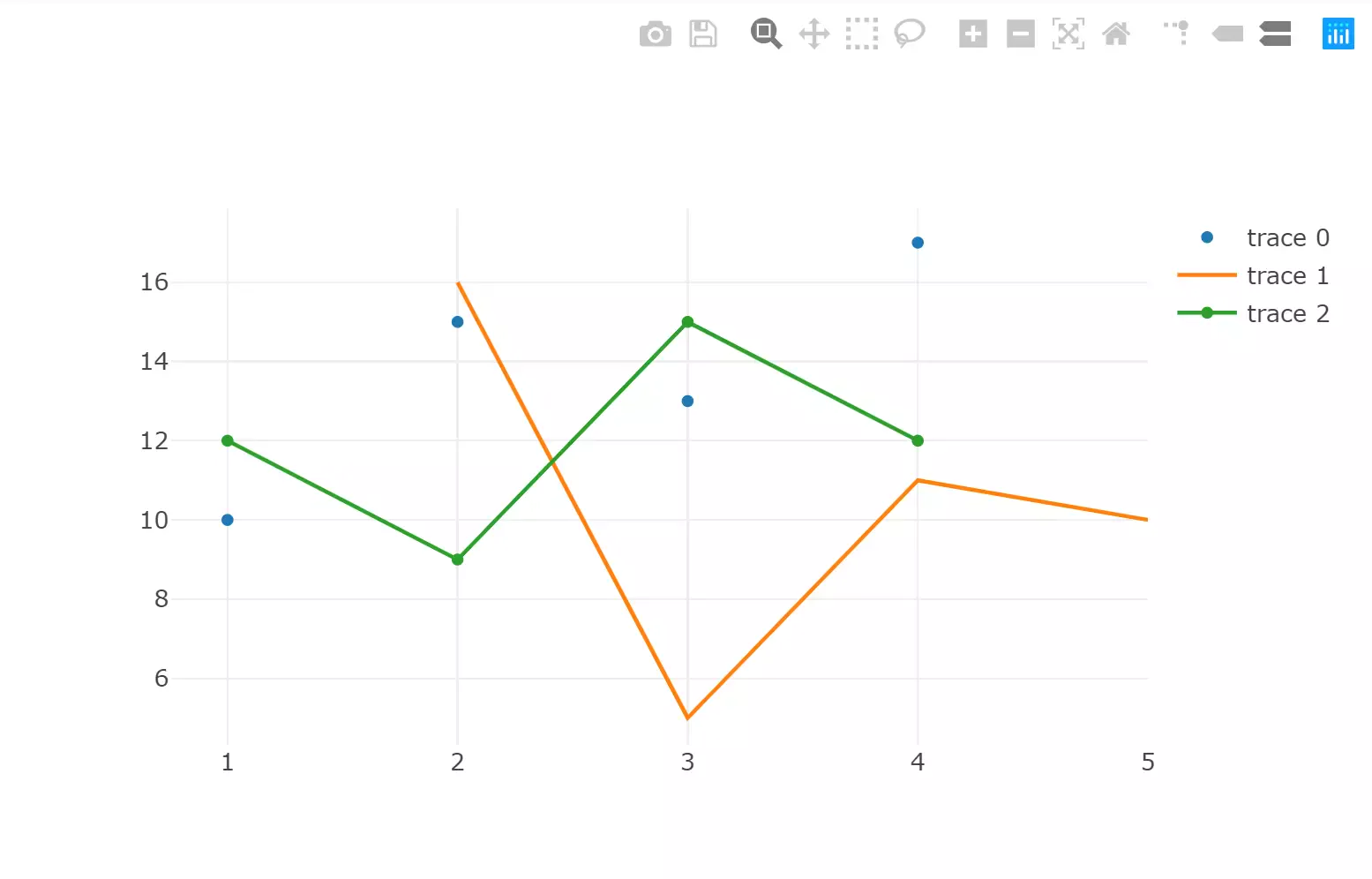
Figure 1
If I hover my mouse over (4, 14), and click, the current Plotly.js onClick event data returns data for each trace at that same x value. So, you would get (4, 17) for trace 0, (4, 11) for trace 1, and (4, 12) for trace 2. This is great if I’m trying to find out information about the traces, but this is not useful at all if I’m trying to get the point on the grid on which I clicked.
Of course, with the event data you get all kinds of other somewhat useful information and functions. etpinard gets close to a solution in this codepen (https://codepen.io/plotly/pen/EyydEj) by using the xaxis and yaxis built-in p2c function. Unfortunately, this doesn’t exactly work, and there is little to no documentation on these conversion functions. There are a few other efforts that take into account the margins of the chart div (https://codepen.io/plotly/pen/BgWLzP), but these also fall short of the mark when it comes to accuracy.
So, if you want the exact coordinates of where you clicked, what are your options? Go rogue D3 and write a custom function? Switch charting libraries completely out of frustration?
The answer, as is the answer to most of my questions with Plotly, is to layer traces. In a nutshell, layering a heatmap trace below all other traces on the plot, utilizing the same axes as the other traces, enables you to get the exact coordinates of a click. How exactly does this work?
By definition, a heatmap is a data visualization where every individual (x, y) pair is assigned a z value, and then colored according to that z-value. The basic Plotly.js heatmap can be seen here (https://codepen.io/plotly/pen/NqJzgm). The Plotly.js heatmap is a combination of three arrays: a 1-d x-axis array, a 1-d y-axis array, and a 2-d z array. Because this chart covers the entire x-y space of the plot, we can get the x-y coordinates for any click event. However, the exactness of those coordinates is based on the x-y intervals from the heatmap’s data.
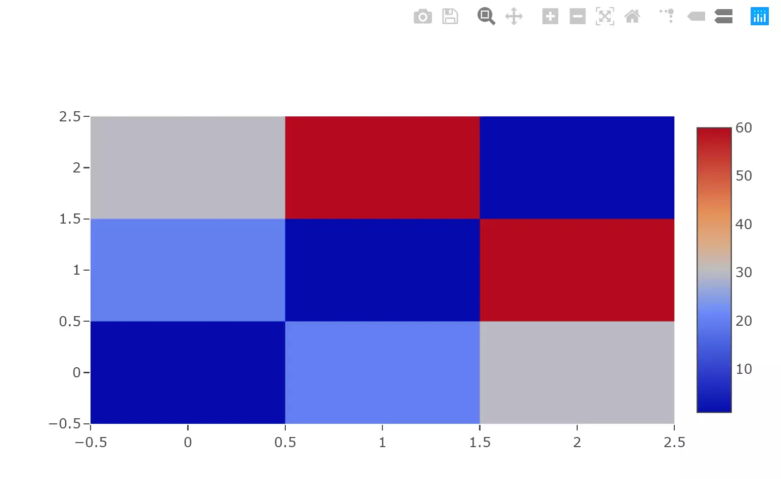
Figure 2
So, let’s make a heatmap with extremely granular x-y intervals: https://codepen.io/plotly/pen/VoGbyR. Looks pretty cool, huh? Let’s use something like this to get accurate click data for a scatter plot.
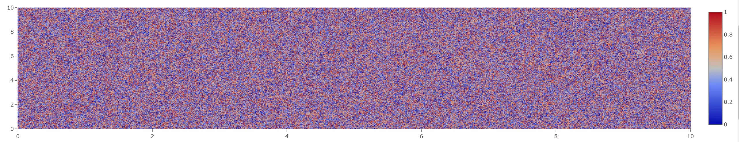
Figure 3
The first step is to generate the heatmap trace according to your data. If we are using Plotly’s out of the box scatter example, the x axis range is [0,6] and the y-axis range is [0,18]. Let’s plan for the x-y scale of the heatmap to be 0.01, so using two separate loops, we prime the x and y arrays for the heatmap:
var x = [];
var y = [];
for(i = 0; i < 6; i = i + 0.01){
  x.push(i);
}
for(j = 0; j < 18; j = j + 0.01){
  y.push(j);
}
Now that the x and y arrays are created, we can use these to generate an appropriately sized z array. Because we don’t actually care about the z value for this implementation, we will set each z array value to 0:
var z = [];
for (j = 0; j < y.length; j++) {
  var temp = [];
  for (k = 0; k < x.length; k++) {
    temp.push(0);
  }
  z.push(temp);
}
The final step is to configure the heatmap data trace using the three arrays we just created. A few notes: the colorscale is manually set so that a z-value of 0 shows as white, to prevent the trace from being visible behind the other traces. Setting the showscale value to false hides the colorbar in the legend, and setting the hoverinfo to ‘x’ prevents the heatmap from showing its values as you pan across the chart. The xgap and ygap values allow the axes grid lines to continue to show through the hidden heatmap layer. I’m sure there is more parameters that could be added to make this trace even more difficult to discern, but I’ll leave that for you to play around with.
var trace4 = {
  x: x,
  y: y,
  z: z,
  type: "heatmap",
  colorscale: [["0.0", "rgb(255, 255, 255, 0.5)"], ["1.0", "rgb(255, 255, 255, 0.5)"]],
  xgap: 1,
  ygap: 1,
  hoverinfo: "x",
  showscale: false
}
Now, adding this trace into the data array for the scatter plot doesn’t make it look much different than before:
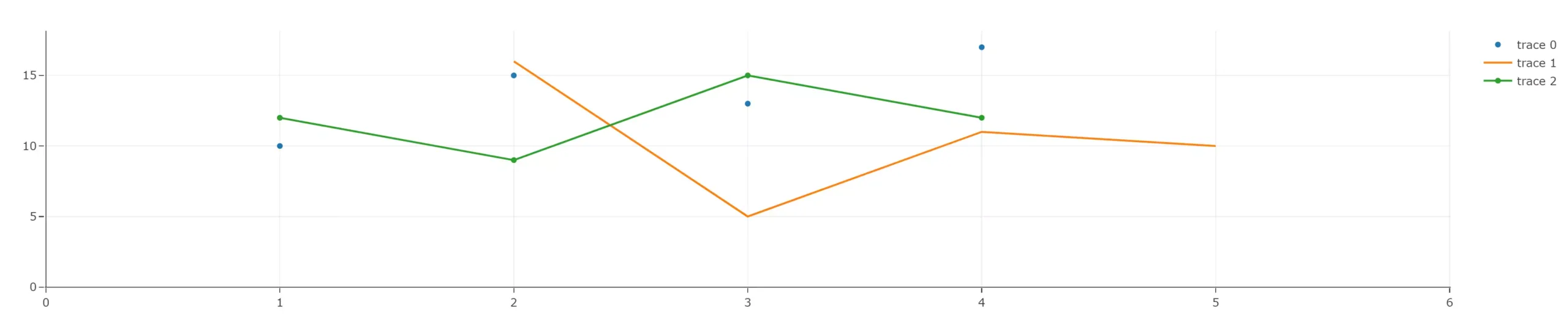
Figure 4
The last thing that needs to be done is to actually bind to the click event and see the data. This can vary depending on your implementation (react-ploty, Angular, etc), so I’ll leave the implementation up to you. The click event data returns an array of points. Each object in this array has a curveNumber attribute; this number is the index of that data trace in the data array that was utilized to make the chart. Using an array filter function, you can grab the specific object that relates to the heatmap trace, then use the x and y attributes belonging to that object, and voila, you have the exact coordinates of your click.
The full solution is up and running in a rudimentary codepen here: https://codepen.io/plotly/pen/bXxWQB
This solution may add overhead to the chart render because it adds an extra trace to your chart. Also, if your chart has multiple axes scales, things could go sideways quickly. However, this is one sure-fire way to get the exact coordinates that you clicked upon, without some wonky point to coordinate conversions that return different values each time. Enjoy!